
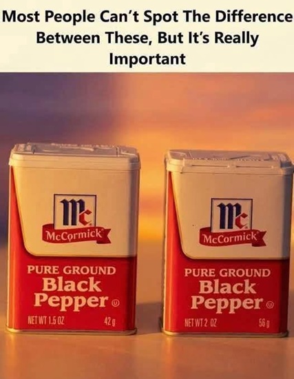
Packaging often influences a buying decision before a shopper has carefully read the label. The size of a bottle, the shape of a box, the colors used on the front, and the familiarity of a brand can all create an immediate impression about quantity and value. Consumers frequently form that impression in only a few seconds, especially when they are shopping quickly or buying something they already know. This does not mean shoppers ignore written information completely. It means visual information is often processed first, which gives packaging considerable influence over expectations.
Most people do not stop to calculate the exact internal volume of every container they see in a store. Instead, they use visual shortcuts. A package that appears large may feel as though it contains more, while a familiar shape may suggest that the quantity is unchanged from a previous purchase. These shortcuts make shopping faster and more practical. However, they can also create confusion when the outside of a package looks familiar even though the amount inside has changed.
Container shape can have a strong effect on perception. Tall, narrow packages may seem larger than shorter, wider containers even when their actual capacities are similar. The human eye does not naturally calculate three-dimensional volume with perfect accuracy. Instead, people may focus on one especially noticeable dimension, such as height. That can make two equal quantities appear different simply because they are presented in different shapes.
Width can influence perception in a different way. A broad, shallow container can seem more substantial from one angle while appearing smaller from another. Deep bases, curved walls, thick materials, and other structural features can also change how much usable internal space a package actually contains. These characteristics may serve legitimate manufacturing or protection purposes, but they also affect what shoppers think they see.
Familiarity makes these effects even stronger. A person who buys the same product every week may recognize the logo and shape long before noticing the printed weight or volume. The package becomes a visual signal associated with a certain quantity. If the design remains largely unchanged, the shopper may naturally assume that the contents are unchanged as well.
This is one reason repeated purchasing often becomes automatic. People know where the product is located on the shelf. They recognize the color. They recognize the container. They may not reread every detail because previous purchases have already created a sense of trust and familiarity.
That habit is efficient, but it can become a problem when the product changes while the visual identity remains almost identical. A slightly smaller amount may not be obvious if the package still looks familiar. The quantity may be printed correctly, yet the shopper’s first impression can still be based on what they remember from earlier purchases.
This gap between visual expectation and written information is an important part of packaging psychology. A shopper may believe they are buying roughly the same amount because the container looks the same. Only later, after reading the label more carefully or comparing an older package, might they notice a difference.
The term “shrinkflation” is often used when the amount of product decreases while the price stays the same or does not decrease proportionally. However, a smaller quantity does not automatically mean that a company has done anything illegal or deceptive. Companies can change package sizes for many reasons, including production costs, shipping efficiency, product reformulation, or changing consumer preferences.
The key issue is transparency.
If the quantity changes, accurate labeling matters.
The net quantity gives shoppers a more reliable measure than visual size alone. A large package does not necessarily contain more product than a smaller one, and a smaller-looking package may sometimes contain nearly the same amount because it uses space more efficiently.
This is why comparing only external dimensions can be misleading.
Two boxes can look very different while containing nearly identical weights.
Two bottles can appear similar while holding different volumes.
The written quantity provides the better comparison.
Unit pricing can make that comparison even easier. Instead of focusing only on the total price, unit pricing shows how much the product costs per standardized amount, such as per ounce, kilogram, liter, or item. This helps shoppers compare packages of different sizes without needing to perform all of the calculations themselves.
A smaller package may have a lower total price but a higher unit cost.
A larger package may require more money upfront but offer a better price per unit.
Without that comparison, package appearance can create a false impression of value.
Unit pricing is especially useful when two brands use very different container shapes. One may come in a tall bottle while another comes in a short, wide tub. Looking only at the packages may make the first appear larger even when the second contains more product.
The amount printed on the package removes that ambiguity.
Opaque packaging can make visual judgments even more difficult. When shoppers cannot see the contents, they have to rely on the exterior and the label. A transparent container gives at least some indication of how full it is, although even transparent packaging can distort perception because shape still matters.
An opaque box or bottle provides no direct view of the product.
That makes net quantity and unit pricing even more important.
Empty space inside a package can also create confusion. Some products need extra space for protection, machinery, sealing, settling, or other functional reasons. For example, certain food packages require headspace to protect the contents during shipping. Chips and other fragile snacks may use additional internal space to reduce crushing.
Therefore, seeing unused space does not automatically mean the package is deceptive.
At the same time, consumer-protection rules recognize that excessive nonfunctional empty space can become misleading in some situations. The legal analysis depends on the product, the jurisdiction, and the specific design. It would be inaccurate to say that any package containing air or unused space is illegal.
It would also be inaccurate to assume that a technically correct quantity statement always resolves every possible concern about the overall presentation.
The complete impression matters.
Consumers experience the entire package, not just one number.
Color also affects perception. Bright colors can attract attention. Dark colors may suggest premium quality in some categories. Familiar brand colors help shoppers recognize a product quickly. These effects vary by culture and context, so there is no single rule that applies to every product.
Still, color clearly plays a role in how packaging communicates.
Typography does too.
Large numbers, bold claims, and prominent words are seen first.
Smaller technical details are often noticed later.
This hierarchy of attention is intentional in design because brands need to communicate quickly in crowded retail environments.
A shopper may see the product name, a promotional claim, and an image before noticing the net weight.
That does not mean the label is inaccurate.
It means visual priority shapes what is noticed first.
This distinction is important when discussing packaging fairly. A package can be visually persuasive without being deceptive. Marketing is designed to attract attention. The problem arises only when the overall presentation creates a materially false or misleading impression.
Without evidence, it is unfair to accuse a specific company of intentionally misleading consumers.
General discussion should therefore focus on how packaging affects perception rather than assuming bad motives.
There are many legitimate reasons for unusual package shapes.
A bottle may need a specific shape to fit manufacturing equipment.
A jar may use thicker glass for strength.
A box may include protective internal space.
A pump container may require mechanisms that reduce the visible amount of usable volume.
These engineering considerations can make a package look larger than the actual product volume without any deceptive intention.
That is why consumers benefit from focusing on measurable information.
Net weight.
Net volume.
Count.
Unit price.
Those details provide a more objective picture.
Serving size can also matter, but it should not be confused with total quantity. A package can contain the same total weight while changing the recommended serving size. That may alter the number of servings printed on the label even though the amount of product remains unchanged.
Conversely, a package can become smaller while the serving size remains the same.
This means shoppers should compare the actual total quantity when determining whether the package itself has changed.
Concentrated products create another challenge. Laundry detergent, cleaning products, and certain foods may come in smaller containers while offering the same number of uses because the formula is more concentrated. Looking only at the physical bottle size could create the wrong impression.
The important question is what the product is designed to deliver.
For detergent, that may be the number of recommended loads.
For paper goods, it may be the number of sheets and total area.
For drinks, it may be volume.
For food, it may be net weight.
Different products require different comparisons.
This is why package size alone is never a perfect measure of value.
Consumers also remember products imperfectly. A person may know that a cereal box “looks smaller” but not remember the exact previous weight. Memory tends to preserve general appearance more easily than precise numbers.
That makes visual continuity powerful.
If the brand colors and dimensions remain similar, the product may feel unchanged even when the quantity is different.
Historical comparisons are therefore more reliable when based on photographs of labels, old receipts, archived product listings, or saved packages.
A side-by-side visual comparison can be useful, but only if both products are truly equivalent.
They should be the same variety.
The same market.
The same product line.
The same type of package.
Otherwise, a comparison can create a misleading conclusion.
Different retailers sometimes sell different package sizes.
The same company may offer a standard version and a family-size version.
Regional markets may use different weights.
Promotional packs may also differ from regular products.
A photograph showing two different packages does not automatically prove that one replaced the other.
Dates matter too.
If someone claims that a package recently became smaller, the old and new versions should be compared using reliable dates.
Without that information, a viral image may simply show two different variants sold at the same time.
Social media can make these misunderstandings spread quickly. A striking before-and-after photograph may attract thousands of reactions before anyone checks the actual product details. Anger can travel faster than verification.
That is why neutral consumer reporting should slow the process down.
First verify the quantity.
Then verify the price.
Then confirm that the products being compared are actually equivalent.
Only after that should conclusions be drawn.
This approach protects both consumers and companies from misinformation.
Packaging psychology remains important even when no misconduct is involved. The fact that consumers react to size, shape, and familiarity is well established in consumer research. It explains why design is such a central part of retail strategy.
A package has to communicate almost instantly.
Who made the product?
What kind of product is it?
How much does it appear to contain?
Does it look premium, affordable, natural, convenient, or familiar?
All of these impressions can form before the shopper reads the detailed label.
That is why packaging can be considered part of the product experience.
It protects the item physically, but it also influences expectations psychologically.
The first impression begins on the shelf.
Trust then determines whether the shopper comes back.
If consumers repeatedly receive what they expect, familiarity strengthens.
If they repeatedly feel surprised or confused, trust can weaken.
Even when a label is technically accurate, an unexpected difference between visual impression and actual contents can create frustration.
This does not automatically mean that the brand acted deceptively.
Perception and legal compliance are not identical questions.
Still, companies have practical reasons to care about both.
A customer who feels disappointed may switch brands regardless of whether any regulation was violated.
Clear communication can therefore benefit businesses as much as shoppers.
If quantity information is easy to find, consumers can make confident decisions.
If package changes are understandable, customers may be less likely to feel misled.
Transparency can strengthen long-term loyalty.
This is especially important during periods of rising costs.
Manufacturers may face higher expenses for ingredients, transportation, labor, packaging materials, or energy.
They may respond by raising prices, changing quantities, reformulating products, or adjusting package designs.
Consumers may not like those changes, but clear information allows them to evaluate the new value for themselves.
The alternative is uncertainty.
And uncertainty often creates distrust.
Retailers also play an important role because shelf labels can make comparisons easier. Consistent unit pricing allows shoppers to compare products without relying entirely on package appearance.
Online retailers can do the same.
Digital stores can display quantity, dimensions, and price-per-unit directly beside the product.
This is especially useful because photographs online can distort scale.
A bottle photographed alone may look much larger than it really is.
Without a familiar object beside it, visual size becomes difficult to judge.
That is why dimensions and quantity information matter even more in e-commerce.
Online shoppers cannot pick up the package.
They cannot compare its weight physically.
They depend on accurate product descriptions.
Digital presentation therefore creates its own version of packaging psychology.
Photographic angle, image size, and scale can influence impressions.
A large product photograph does not mean a large package.
A small image does not mean a small quantity.
Numbers remain the reliable comparison.
The same principle applies when viewing social-media posts about packaging. A close-up photograph can exaggerate the apparent dimensions of one package compared with another.
Perspective matters.
Distance matters.
Camera angle matters.
Lighting can also influence perception.
That is why visual evidence should be supported by measurements.
A package that looks half the size may not actually contain half the product.
A package that looks unchanged may have different dimensions internally.
Only the stated quantity reveals the actual amount being sold.
Consumers can protect themselves with a few simple habits.
Check net quantity periodically, even for familiar products.
Look at unit price when it is available.
Compare like-for-like products.
Pay attention to concentration and serving instructions.
Do not rely entirely on package height or width.
These steps take only a few seconds once they become routine.
They also reduce the influence of visual shortcuts.
A shopper does not need to distrust every package.
They simply need to remember that appearance is not measurement.
This distinction is especially useful for household products purchased repeatedly.
Cereal.
Coffee.
Detergent.
Paper products.
Snacks.
Cosmetics.
Cleaning supplies.
Many of these categories use distinctive container shapes that become strongly associated with the brand.
That familiarity can make changes harder to notice.
Packaging designers understand that brand recognition is valuable. Maintaining a familiar shape helps customers locate the product quickly.
Changing the entire package every time quantity changes would also create confusion.
So visual continuity can have legitimate business benefits.
The challenge is maintaining clarity at the same time.
Design and transparency do not have to conflict.
A package can remain recognizable while making important quantity information easy to see.
Retailers can reinforce that clarity with unit pricing.
Consumers can reinforce it by checking measurements.
The result is a more balanced system.
Packaging also carries environmental implications. Larger containers may use more material than necessary, but packaging that is too small or weak can lead to product damage and waste.
Efficient design therefore requires tradeoffs.
Material use.
Shipping efficiency.
Protection.
Shelf space.
Consumer convenience.
Manufacturing cost.
All of these factors matter.
A visually large package is not automatically wasteful.
A compact package is not automatically environmentally superior.
The entire lifecycle matters.
For example, concentrated products can reduce packaging and transportation needs because less volume is shipped for the same number of uses.
In that situation, a smaller bottle may actually represent better efficiency.
Again, appearance alone does not tell the complete story.
This is why accurate consumer information is more useful than assumptions.
A shopper should know how much is inside.
How much it costs.
How many uses it provides.
And how that compares with alternatives.
The design can then be judged separately.
Some people may prefer attractive packaging enough to pay more.
Others care only about unit price.
Both are legitimate preferences.
Value is personal.
Quantity is objective.
Keeping those two ideas separate makes comparisons easier.
The same is true for premium packaging. Heavy glass, elaborate boxes, and decorative containers can make a product feel more luxurious.
That impression may be part of what the buyer is paying for.
In perfumes, cosmetics, gifts, and specialty foods, the package can itself be part of the experience.
In those cases, judging value only by the amount of product may miss part of the reason the item exists.
Still, quantity should remain clearly disclosed.
Transparency is useful at every price level.
Consumers deserve to know what they are buying.
Brands benefit when expectations match reality.
The most effective packaging therefore combines design with clarity.
It can look distinctive.
It can communicate quality.
It can attract attention.
And it can still make important information easy to understand.
That balance supports trust.
Trust is particularly important after a package redesign. Customers may immediately notice new colors or shapes and wonder whether the product changed.
Clear quantity information helps answer that question.
If the amount is unchanged, shoppers can verify it quickly.
If the amount changed, they can see that as well.
This reduces speculation.
It also reduces the risk of inaccurate social-media claims.
Packaging debates often become emotional because consumers feel that they are making repeated purchases based on an established expectation.
When that expectation changes unexpectedly, people can feel personally frustrated.
That reaction is understandable.
But the most useful response is still factual comparison.
What was the old quantity?
What is the new quantity?
What was the old price?
What is the new price?
What is the unit cost in each case?
Those questions provide a stronger basis for discussion than appearance alone.
A package can look larger and still be worse value.
It can look smaller and still be better value.
It can remain the same size while changing quantity.
It can change shape while keeping quantity constant.
Packaging is therefore a signal, not a measurement.
The measurement is the measurement.
This may sound obvious, but consumer research shows why the distinction matters. Human beings consistently rely on visual impressions when estimating volume.
That is not a personal failure.
It is a normal feature of perception.
Awareness simply helps shoppers correct for it.
The same principle applies beyond retail. People judge plates, glasses, storage containers, and serving sizes partly by visual dimensions.
Height and width can influence estimates.
Shape can influence estimates.
Context can influence estimates.
Packaging belongs to this broader pattern of human visual perception.
Brands use design because it works.
Consumers use shortcuts because they save time.
Regulators use labeling rules because visual judgment alone is not enough.
Retailers use unit pricing because package sizes are difficult to compare directly.
All of these systems respond to the same underlying reality.
People need both visual information and measurable information.
When the two align, shopping feels simple.
When they conflict, confusion grows.
That is why transparency matters so much.
A consumer who understands exactly what is being purchased can decide whether the product is worth the price.
That decision may still favor the expensive item.
Or the smaller item.
Or the familiar brand.
The important point is that the choice is informed.
Informed purchasing does not require reading every word on every label.
It requires knowing which information is most useful.
Net quantity.
Unit price.
Count.
Concentration.
Serving or usage information when relevant.
Those details are often enough.
The package can then be appreciated for what it is.
A design.
A container.
A brand signal.
Not a precise visual measurement of what is inside.
This is the broader lesson behind packaging psychology.
What shoppers see affects what they expect.
What labels say determines what they can verify.
And what they actually receive determines whether trust is maintained.
A good retail experience brings those three things together.
The package looks appropriate.
The information is clear.
The contents match the expectation created by the overall presentation.
When that happens, consumers can shop quickly without feeling uncertain afterward.
When it does not, they may begin questioning the product, the brand, or the value.
That is why packaging design matters far beyond appearance.
It shapes perception before the first word is read.
It influences how value is judged.
It affects familiarity and trust.
And it can determine whether a shopper feels confident about what they are placing in the cart.
The simplest protection is equally clear.
Look at the design.
Then look at the numbers.
Because the package may shape the first impression, but the quantity tells you what you are actually buying.

