
In the high desert landscape of the American Southwest, near the red rock formations of Sedona, Arizona, there exists a uniquely styled McDonald’s that reflects strict local design regulations and environmental planning priorities.
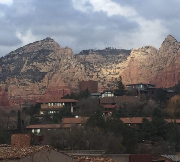
Sedona is widely known for its dramatic sandstone formations, scenic beauty, and long-standing commitment to preserving its natural visual environment through carefully regulated development and architectural guidelines.
Unlike typical commercial areas across the United States, Sedona enforces strict design codes that require buildings, signage, and colors to blend harmoniously with the surrounding desert landscape.
These regulations are intended to protect the region’s natural aesthetic, ensuring that commercial structures do not visually dominate or distract from the iconic red rock scenery that defines the area.
When McDonald’s Corporation planned to open a location in Sedona in the early 1990s, the project had to comply with these local zoning and design requirements before receiving approval.
As part of the approval process, city planners required modifications to the restaurant’s exterior signage to ensure it would not clash with the natural tones of the environment.
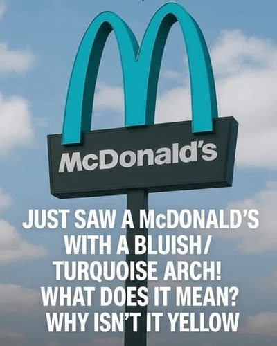
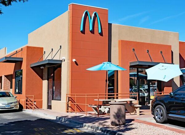
The most notable change involved the color of the iconic golden arches, which were adjusted from their standard bright yellow to a more subdued turquoise tone.
This color adjustment was chosen specifically to better complement the surrounding desert sky and red rock formations, rather than to promote branding visibility.
The modification is not unique in the sense of being a corporate redesign initiative, but rather a compliance-driven adaptation to local aesthetic regulations.
Sedona’s planning authorities have long emphasized “visual harmony,” which encourages all commercial properties to adopt earth-toned or muted colors in order to preserve the region’s scenic character.
The McDonald’s location in Sedona therefore reflects a broader urban planning philosophy that prioritizes environmental integration over standardized corporate branding.
Over time, this specific restaurant has gained attention due to its unusual color scheme compared to typical McDonald’s locations worldwide.
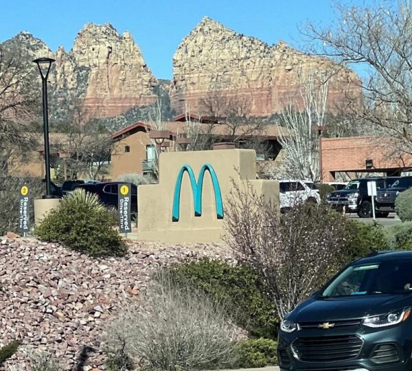
Visitors often notice the difference immediately, as the turquoise arches stand out against both the natural landscape and the expected global branding standard.
However, the purpose of the color change was not to create a tourist attraction but to comply with local regulations designed to protect Sedona’s visual identity.
Despite this, the location has become widely photographed and frequently shared on travel platforms due to its distinctive appearance.
The surrounding region of Sedona attracts visitors for hiking, photography, and sightseeing, with landmarks such as red rock trails and scenic overlooks drawing large numbers of tourists annually.
Many visitors passing through the area encounter the McDonald’s location as part of their travel routes, often noting its unusual integration into the desert environment.
The building itself functions as a standard fast-food restaurant, offering the same menu and operational structure as other McDonald’s locations across the United States.
There are no changes to food offerings or service models, only exterior modifications required to meet local zoning standards.
The turquoise color choice aligns with Sedona’s broader emphasis on natural aesthetics, which often include desert blues, reds, and earth tones in approved architectural designs.
Local regulations in Sedona are among some of the most visually restrictive in the United States, especially regarding signage size, brightness, and color saturation.
These rules were developed to ensure that commercial expansion does not disrupt the region’s identity as a natural and spiritual tourism destination.
As a result, many businesses operating in Sedona must adapt their exterior designs to meet these guidelines before receiving construction approval.
The McDonald’s location serves as a well-known example of how global corporations can adjust branding elements when operating within strict local regulatory frameworks.
Over time, the turquoise arches have become widely recognized by visitors and internet audiences, often featured in travel photography and social media posts.
This visibility has contributed to the restaurant becoming an informal landmark within Sedona, despite not being originally designed for that purpose.
The phenomenon illustrates how local planning decisions can influence public perception and transform ordinary commercial buildings into recognizable cultural reference points.
It also highlights the interaction between global branding systems and localized architectural control policies in tourism-heavy regions.
Sedona’s approach demonstrates how municipalities can maintain environmental aesthetics while still accommodating major international businesses.
The McDonald’s location continues to operate as a fully functional restaurant, serving both residents and tourists who visit the area.
Its design remains consistent with city regulations, ensuring ongoing compliance with zoning requirements related to color and visual impact.
The turquoise arches are therefore best understood as a regulatory adaptation rather than a marketing innovation or corporate branding experiment.
This case is often referenced in discussions about architectural regulation, urban planning, and the balance between commercial identity and environmental preservation.
It shows how design restrictions can shape the appearance of globally recognized brands in specific geographic contexts.
The broader Sedona region continues to enforce similar guidelines for all commercial properties to preserve its distinctive desert character.
As tourism continues to grow, these regulations remain central to maintaining the visual consistency of the area’s built environment.
The McDonald’s location stands as one example of how such policies are implemented in practice, rather than as a unique exception.
Ultimately, it reflects a broader principle that local environments can significantly influence even the most globally standardized corporate designs.